25 Insane Infographics That Are Crimes Against Data
Carly Tennes
Published
08/28/2024
in
facepalm
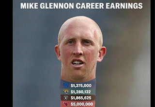
Have you ever visited Latvia only to discover it was not solely inhabited by giant Amazon women? Or ran into former Miami Dolphins quarterback Mike Glennon to find that his neck was not comprised of every team he repped during his NFL career? If so, you may be a victim of graph crimes, data visualizations so convoluted the viewer comes away knowing less than when they started.
From scale-free monstrosities to a CNBC map that mislabeled nearly every state in the entire U.S.A., here are 25 infographics driving us up a wall.
- List View
- Player View
- Grid View
Advertisement
-
1.

-
2.

-
3.

-
4.
 In February 2020, CNBC published this map that mislabeled nearly every state.
 -
5.

-
6.
 Using Chernoff Faces as a method of data mapping various outcomes in health and education, this graph leaves viewers with more questions than answers.
 -
7.

-
8.

-
9.

-
10.

-
11.

-
12.

-
13.

-
14.

-
15.

-
16.

-
17.

-
18.

-
19.

-
20.

-
21.

-
22.

-
23.

-
24.

-
25.


1 Comments