25 Pieces Of Deception Design That'll Give You Trust Issues
Cody Brousher
Published
04/10/2024
in
facepalm
When you design something like this you not only don't have any respect for your consumer, but you have no intention of repeat customers.
- List View
- Player View
- Grid View
Advertisement
-
1.

-
2.
-
3.
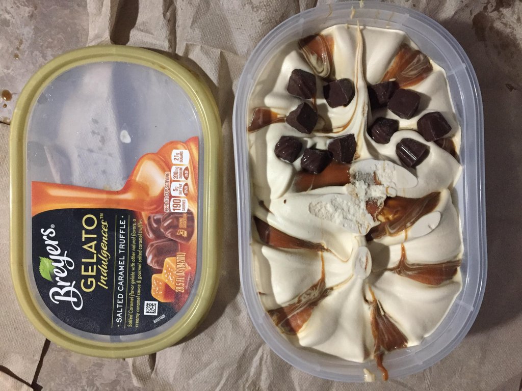 Bryers only puts truffles on the transparent side of the lid.
 -
4.
 There's only enough of whatever the heck that is to fill the transparent window.
 -
5.
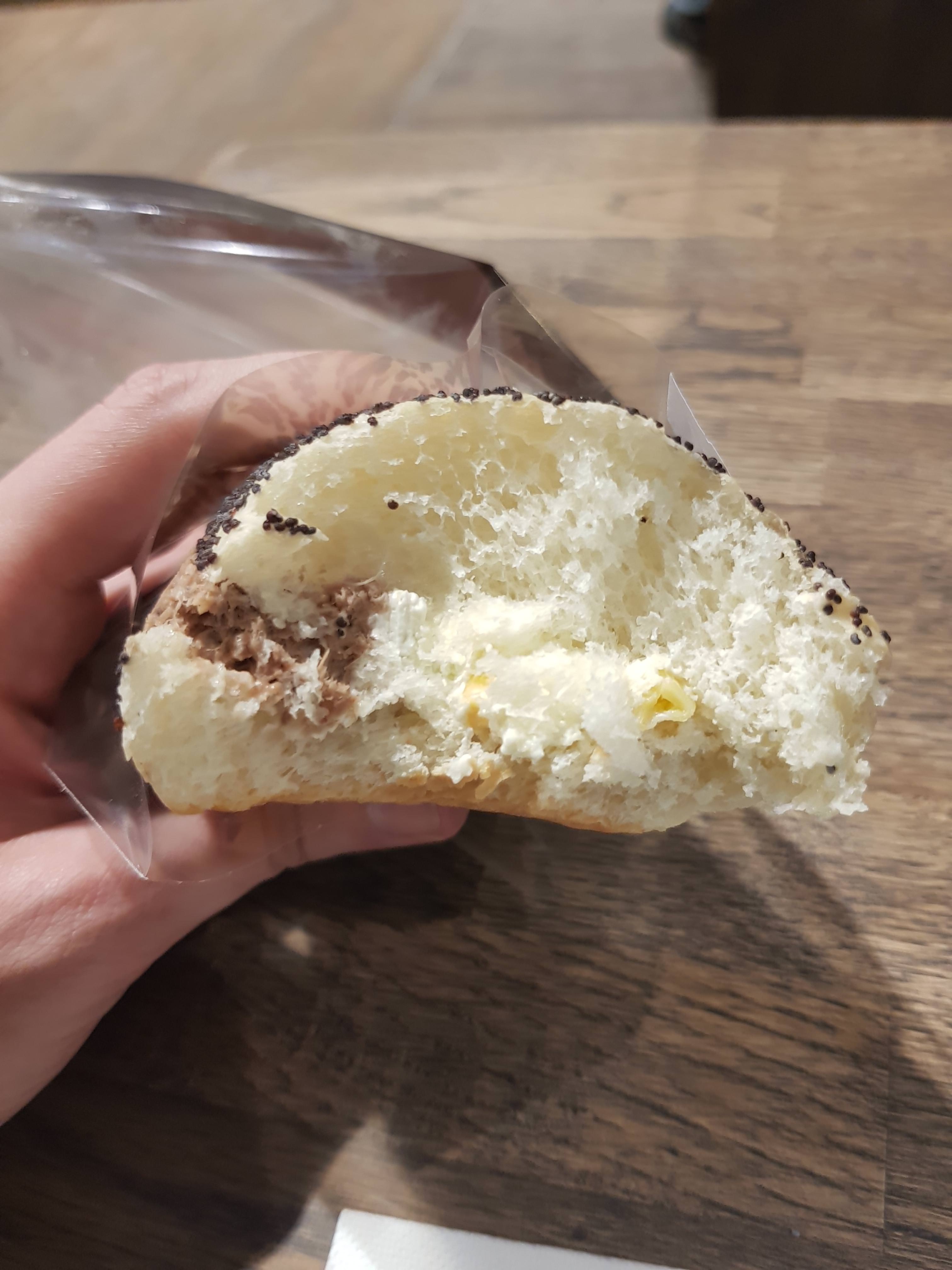
 When sandwich makers only put enough of the tuna to make it look like it's a tuna fish sandwich.
 -
6.
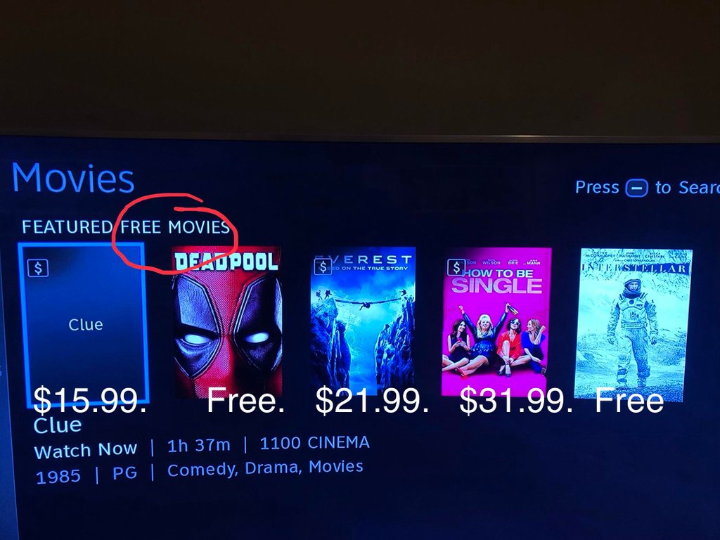 I'm not sure DirecTV understands what the word FREE means.
 -
7.
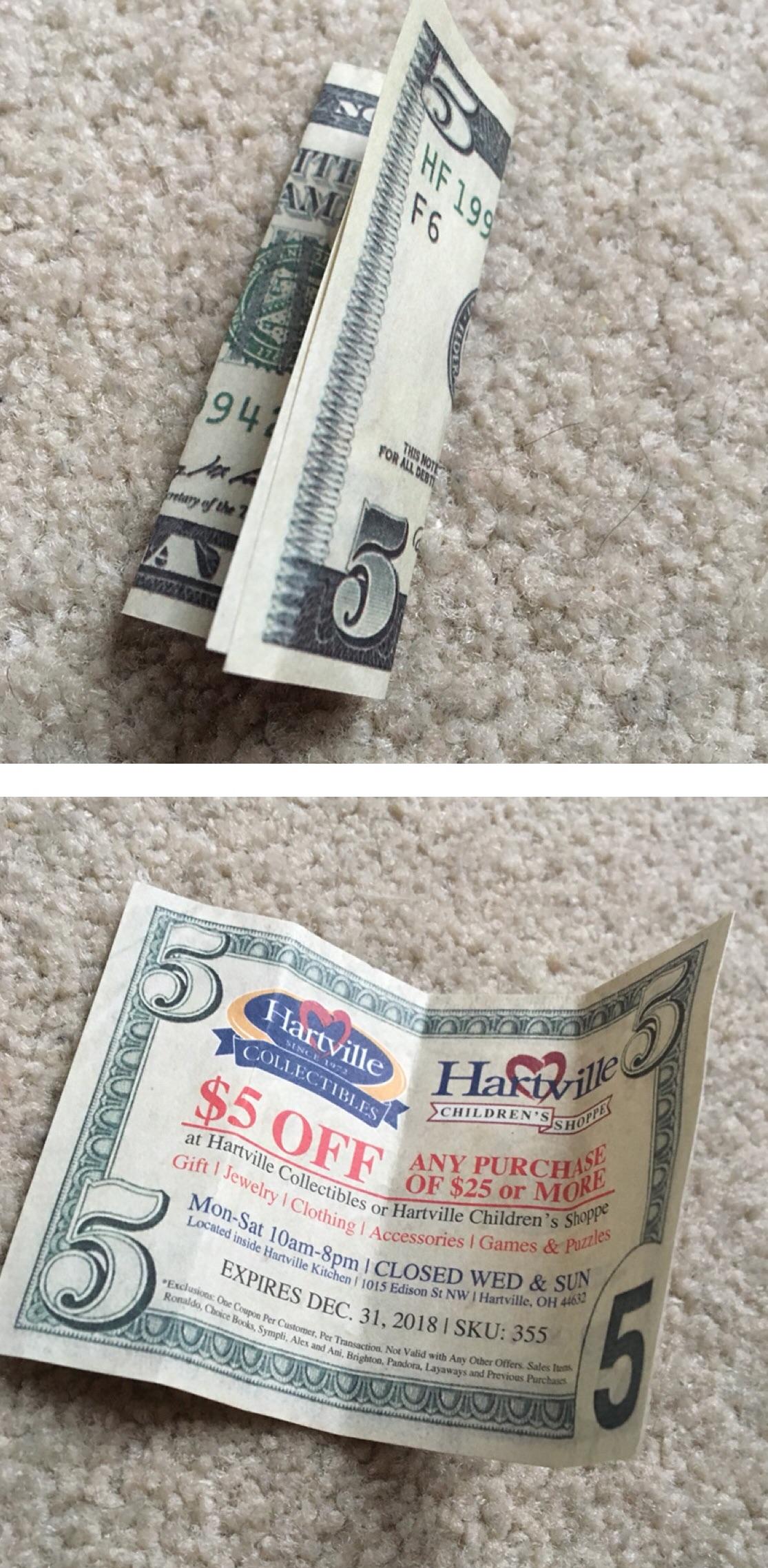 These things are the worst. Any place that does this deserves to go out of business.
 -
8.
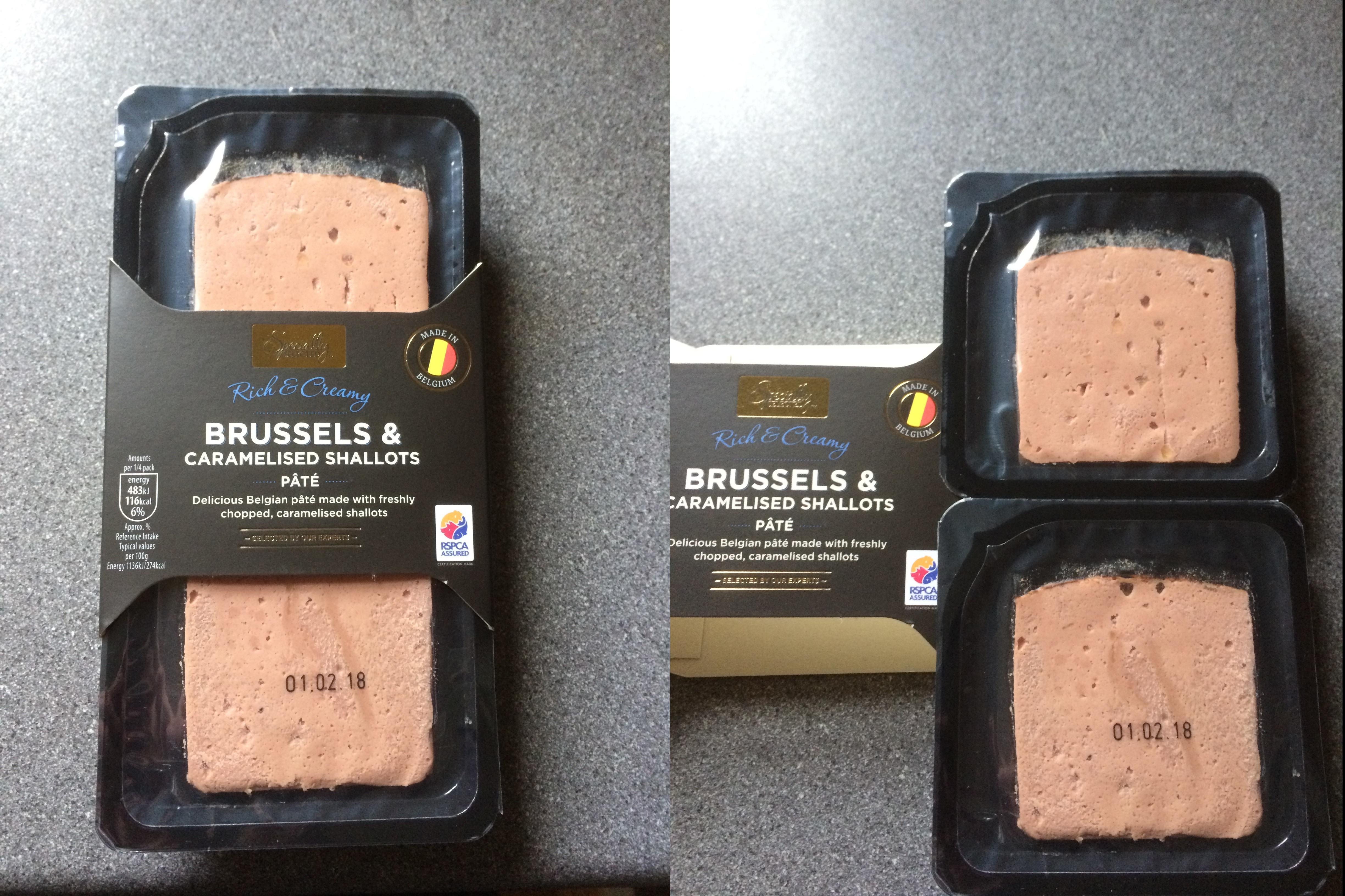 While I have no idea who is possibly eating this, this is clearly deceptive because it appears that the *barfs* Brussels and caramelized shallots pate log goes all the way across.
 -
9.
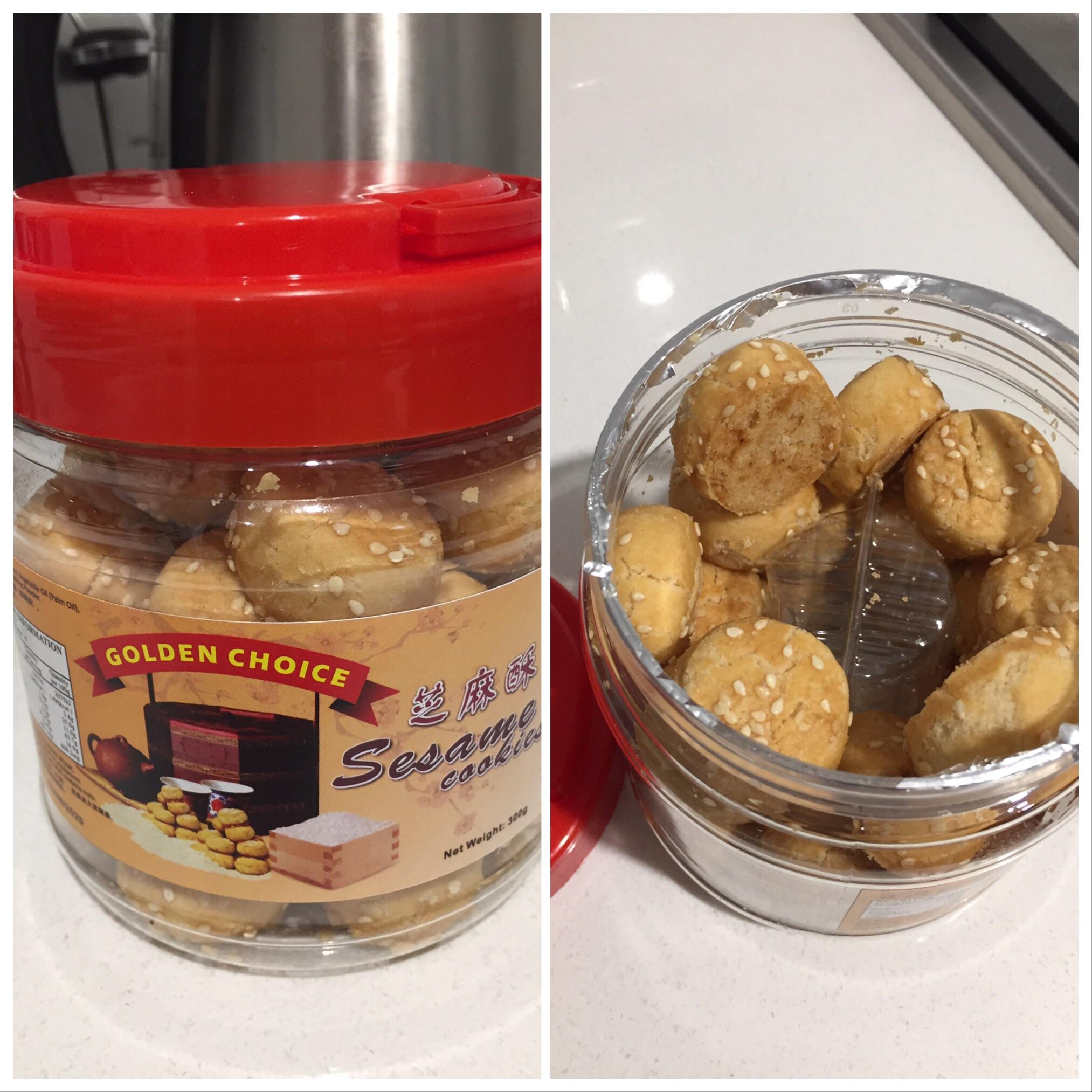 Unless you turned over the container of sesame cookies you'd have no way of knowing that the entire container isn't completely filled until you opened it.
 -
10.
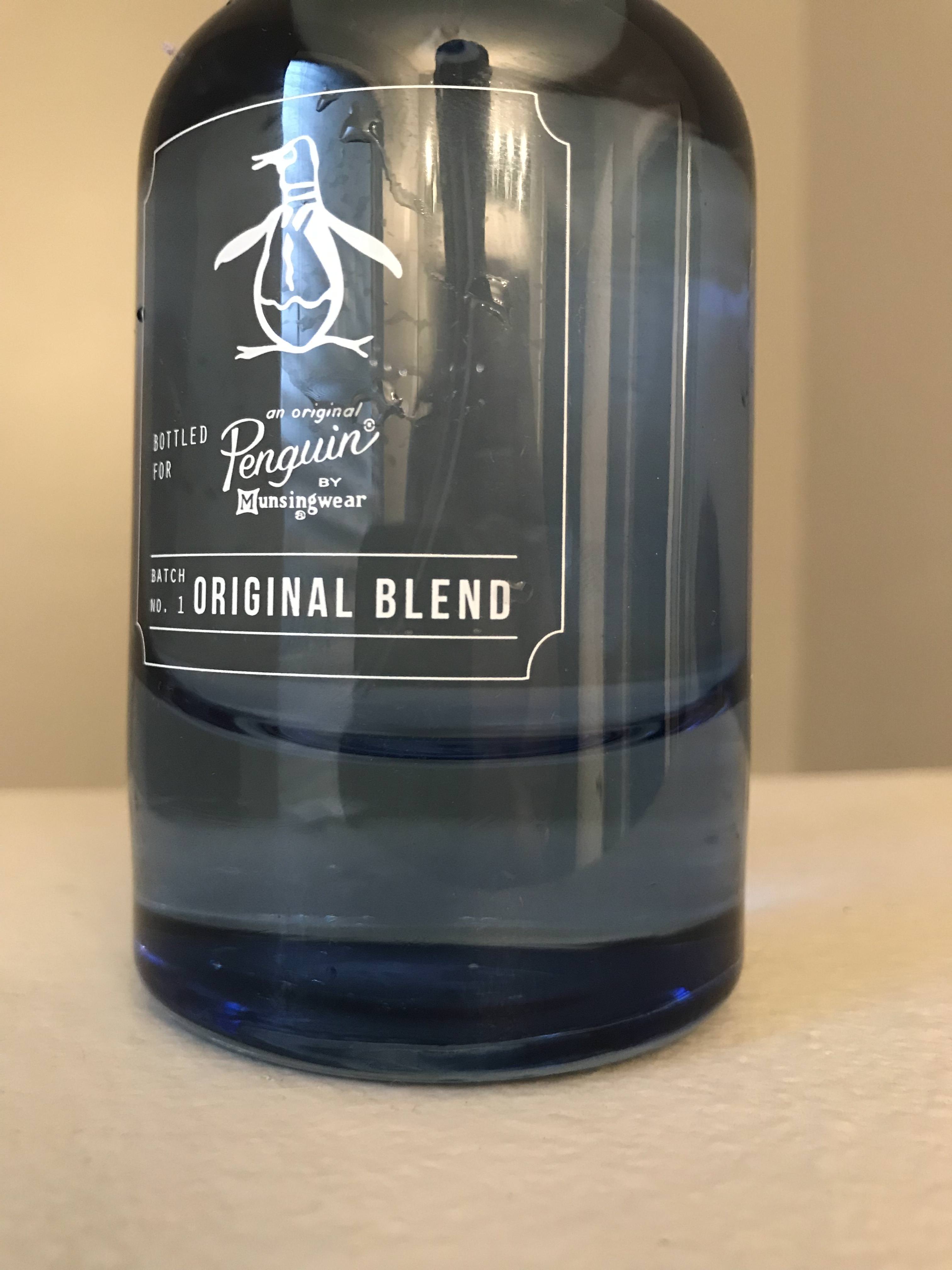 The bottom three inches of this bottle are solid glass to give the illusion that it's holding more liquor than it actually is.
 -
11.
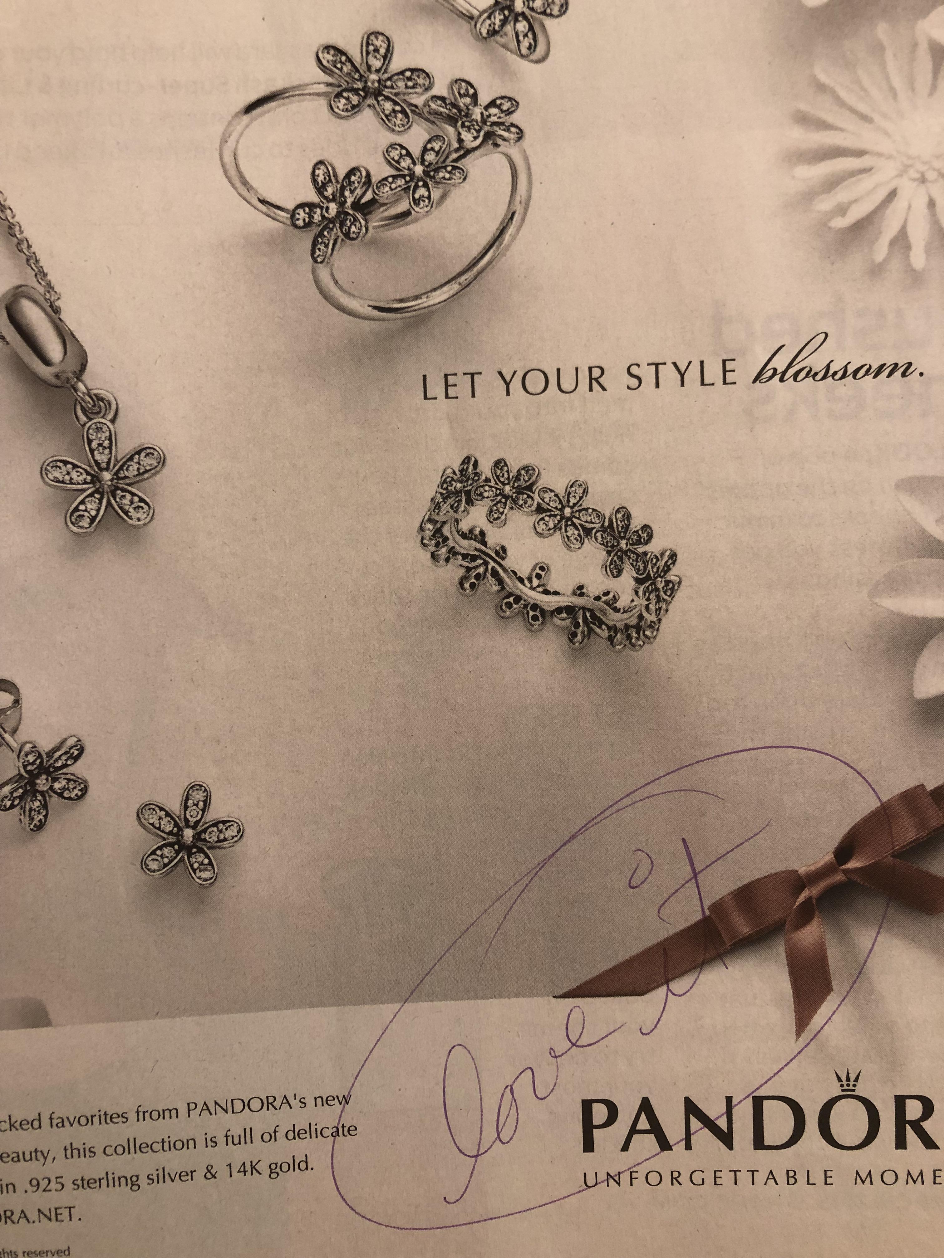 This one takes the cake. This actually has fake handwriting on it to try to fool men into thinking that the woman in their life likes this.
 -
12.
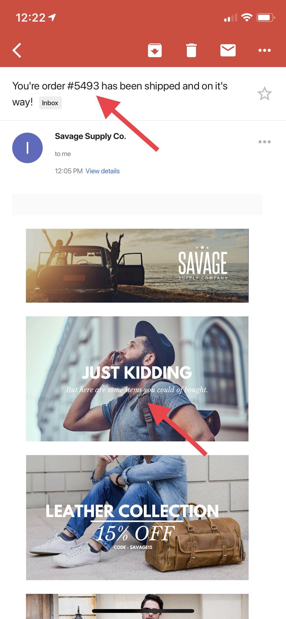 When you're so desperate to get people to open your email newsletter than you trick them into thinking that they have an order on the way.
 -
13.
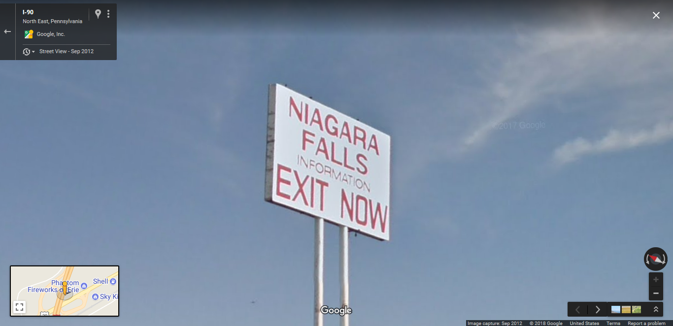 This sign is made to trick tourists into getting off the highway almost 100 miles from Niagra Falls.
 -
14.
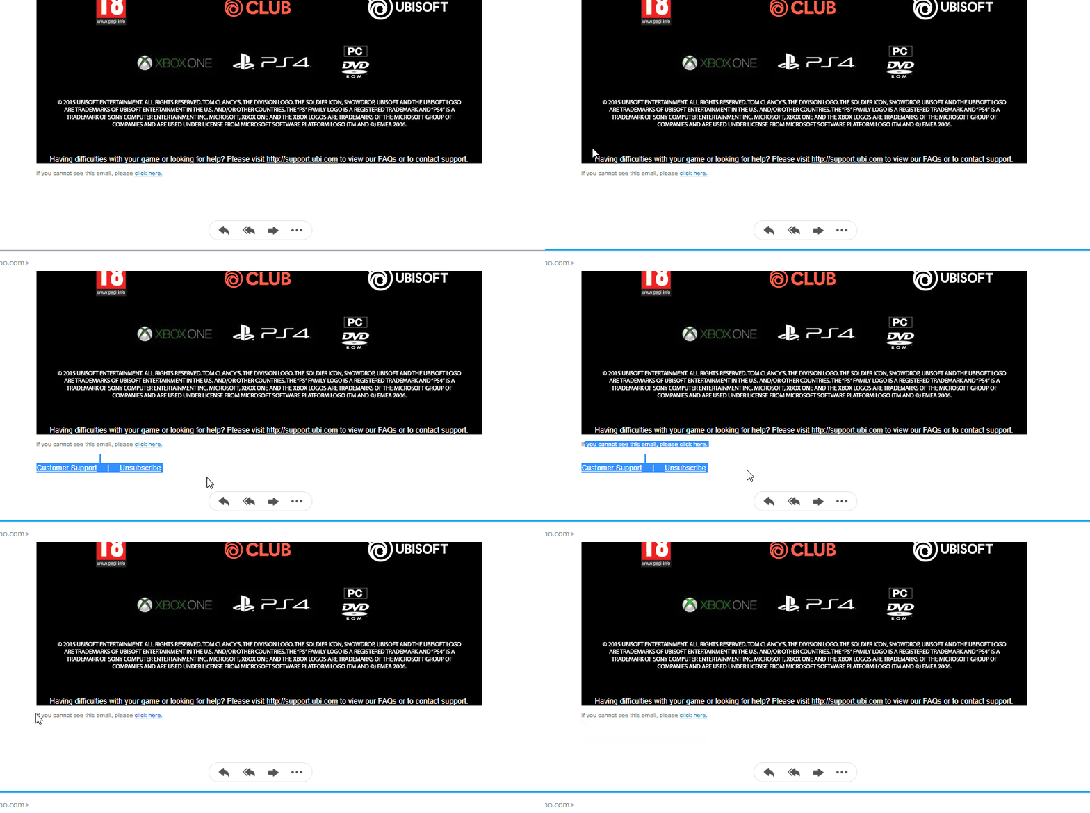 When a company is so desperate to keep people from unsubscribing they actually make it next to impossible.
 -
15.
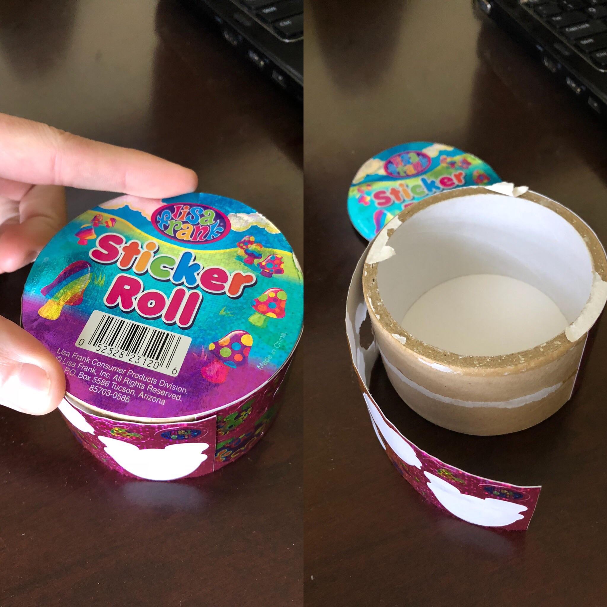 This sticker roll only had 20 stickers on it.
 -
16.
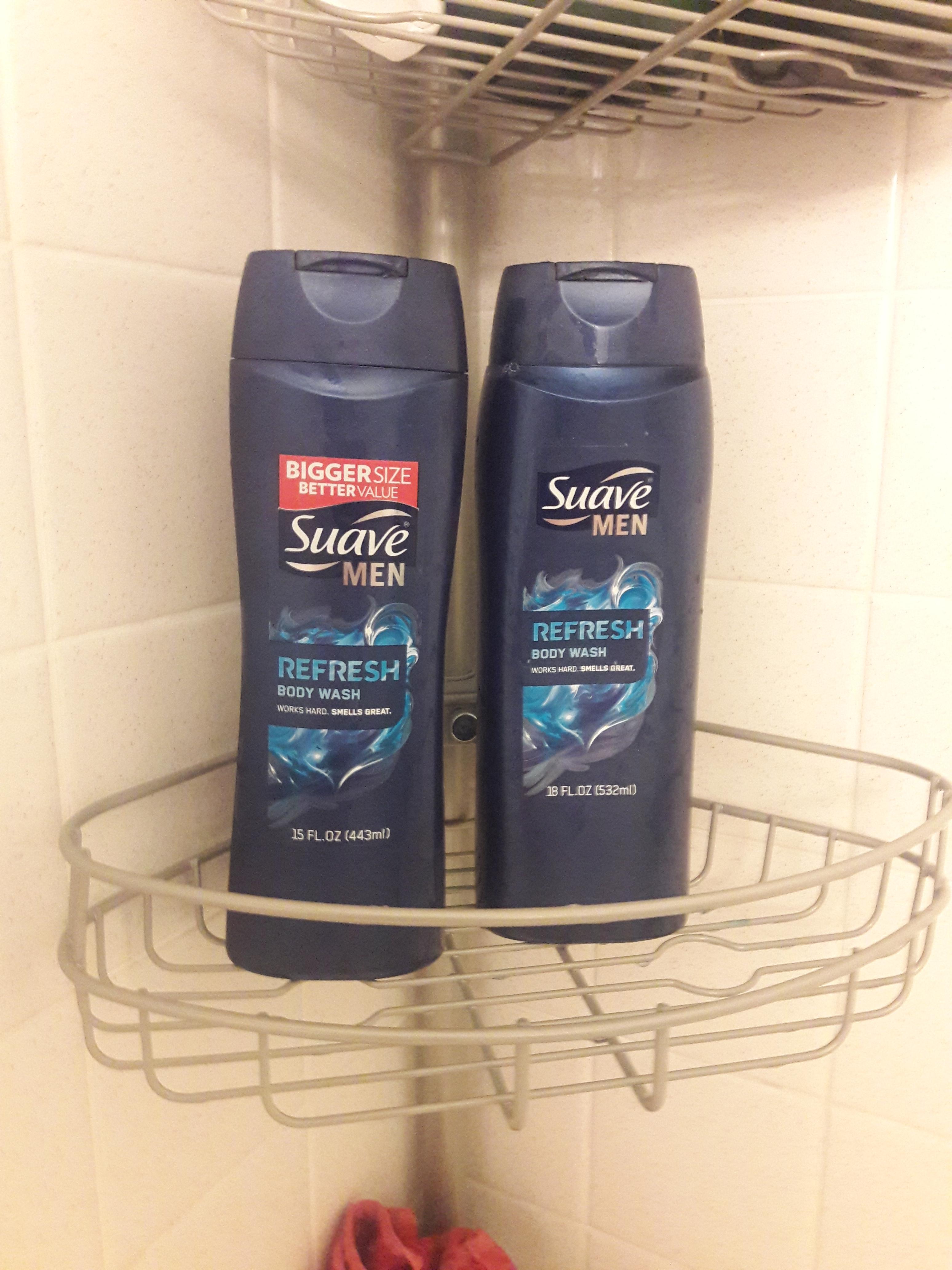 This "bigger size" is 17% less than the normal size.
 -
17.
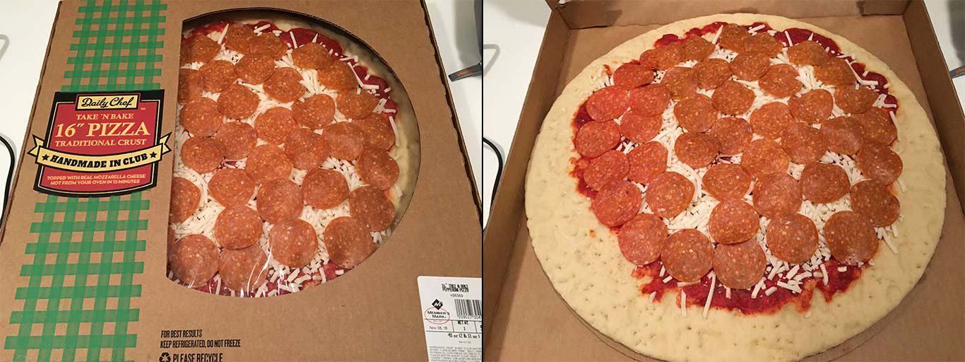 They knew exactly what they were doing.
 -
18.
-
19.
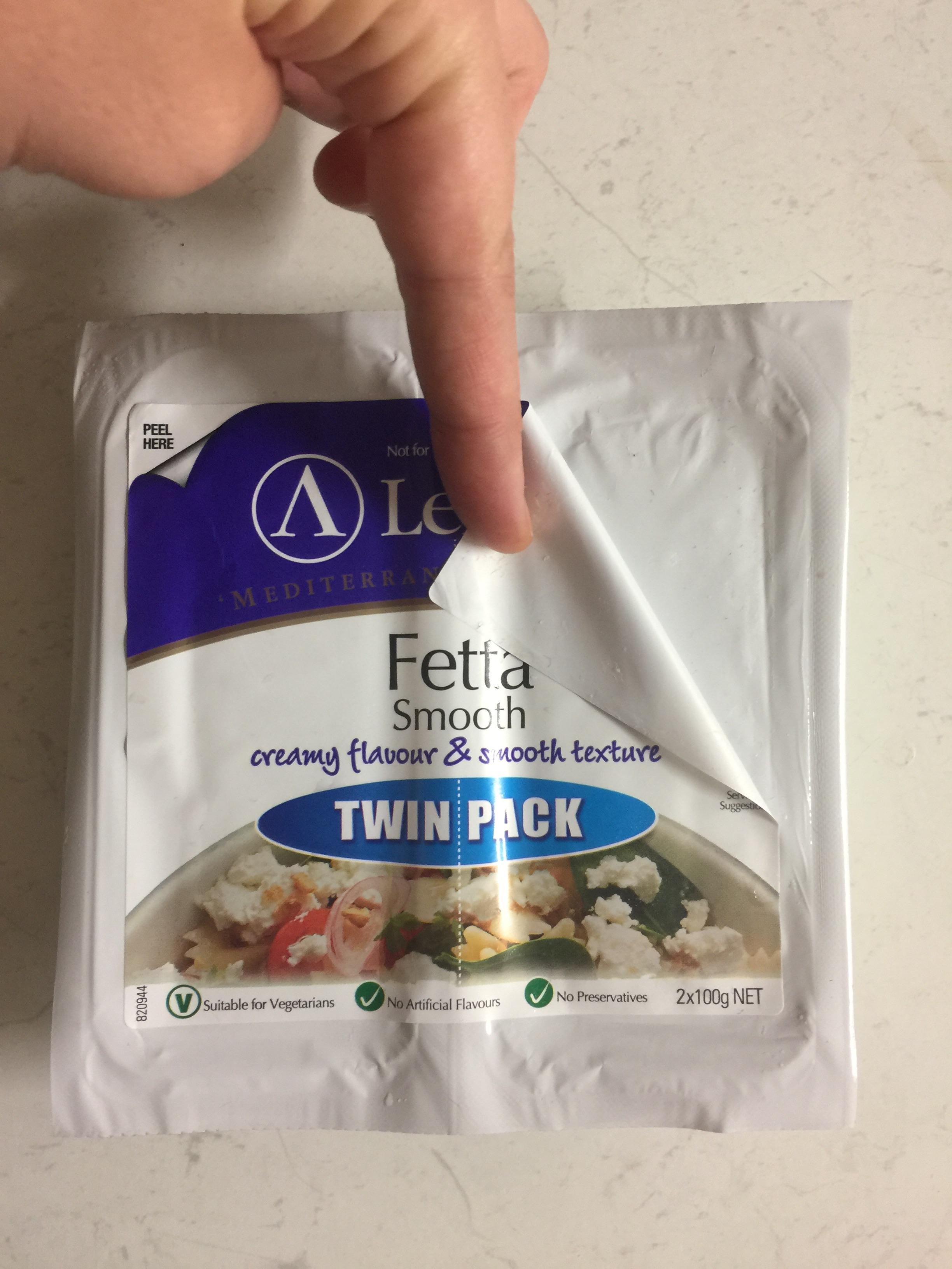
 Math is hard.
 -
20.
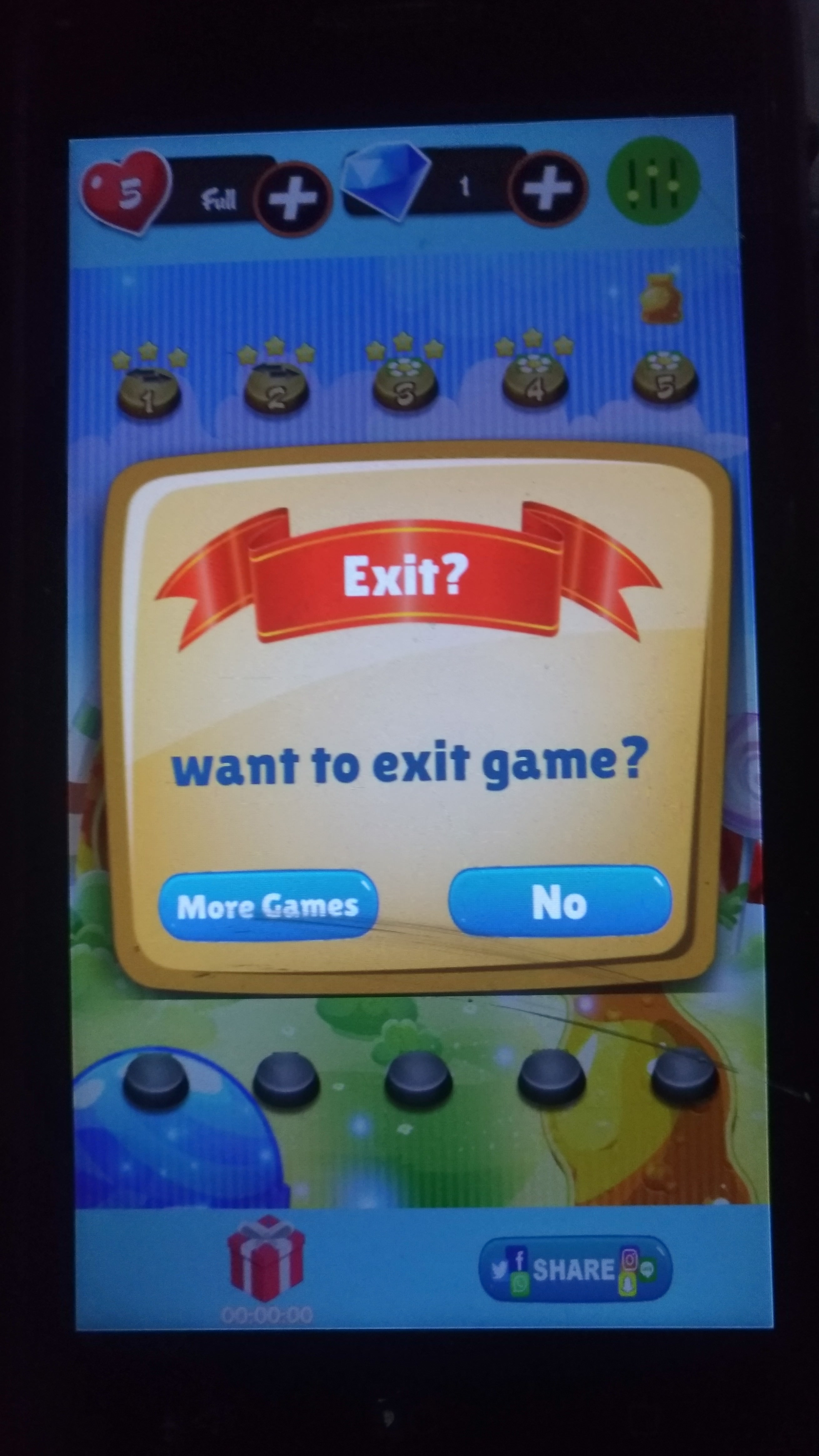 This is an automatic uninstall. There's a special place in hades from app designers that do this.
 -
21.
 Cinemark's $10 bulk candy "fill as much as you want" and the bucket is this sized? Thanks, but no thanks.
 -
22.
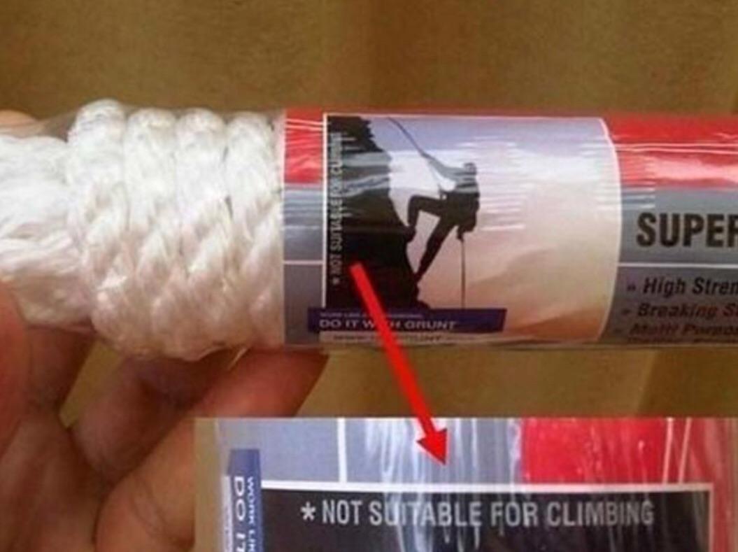 Now what a second, here...
 -
23.
 That time Ted Cruz tried to trick elderly people into opening his campaign fundraising letters by making them appear to be a summons from the court.
 -
24.
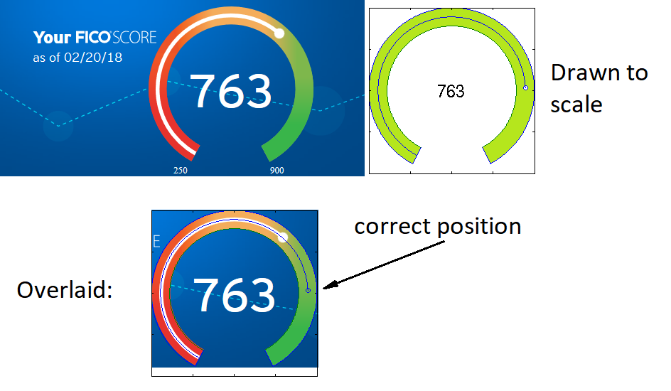 Citibank's FICO rating scale purposefully makes you feel like your score is lower than it is.
 -
25.
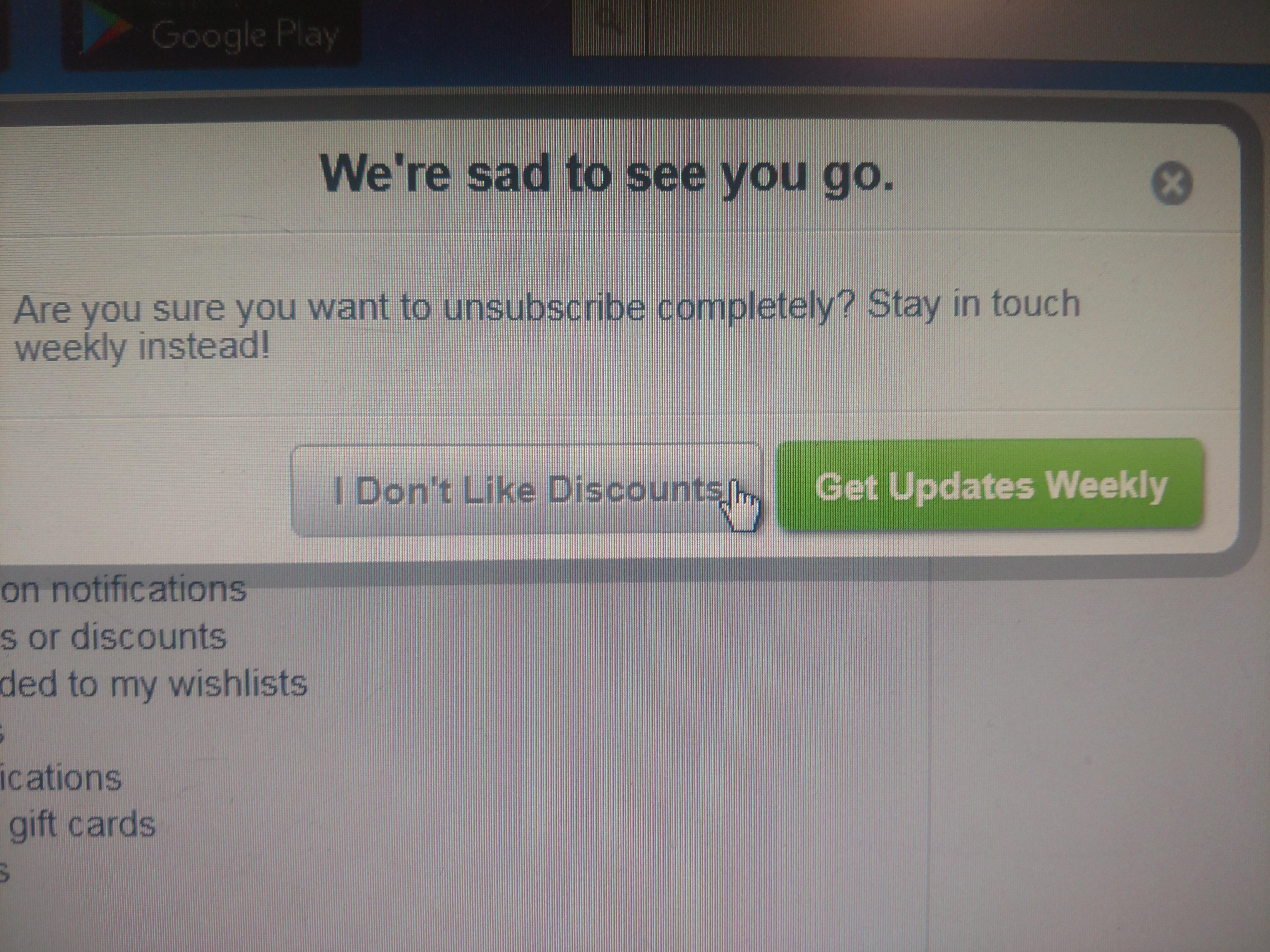 These buttons are always such an infuriatingly dumb way to try to continue annoying your customers until they leave you completely.
 -
26.
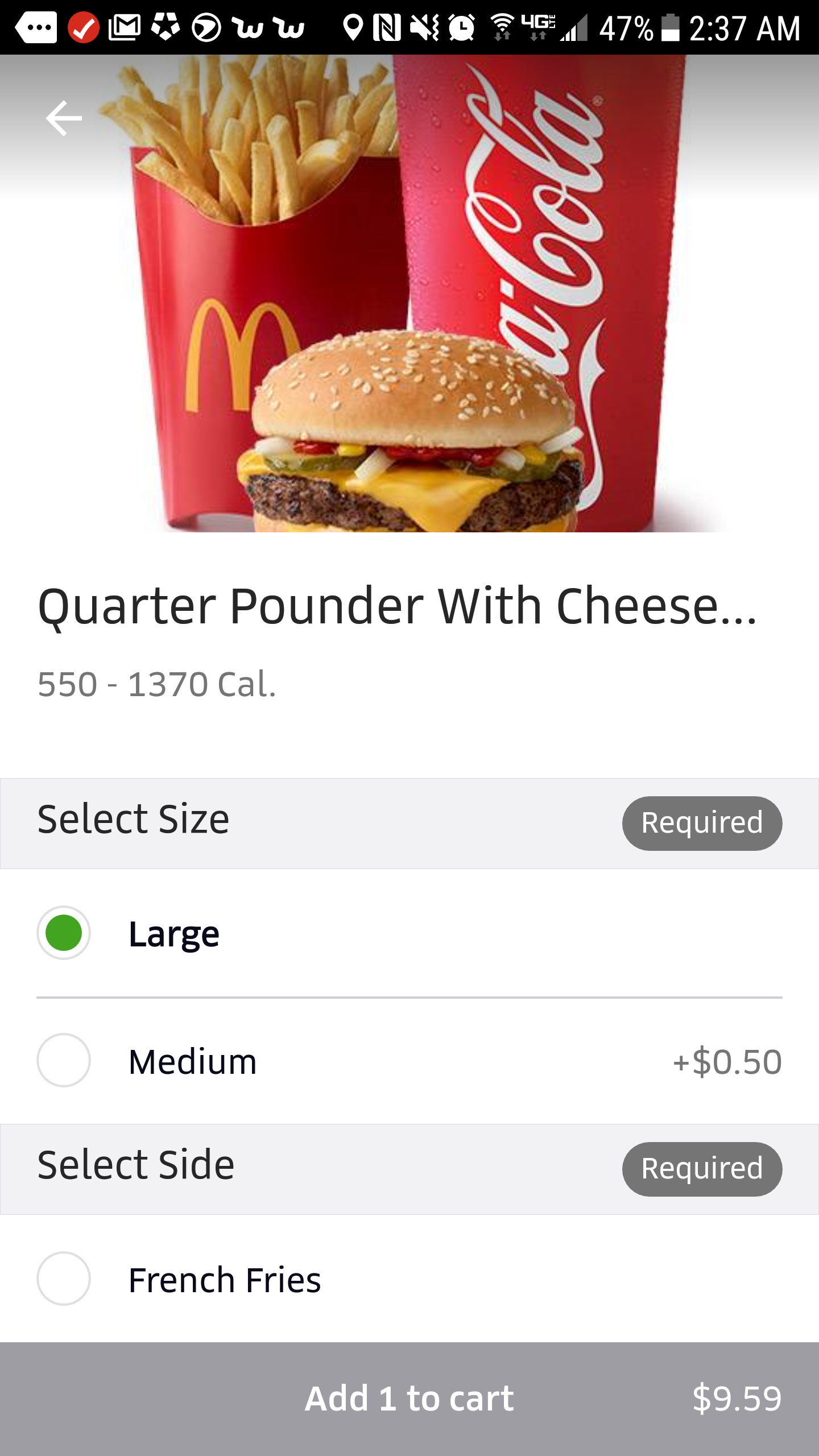 Wait, they're charging you LESS for more fries? This isn't deceptive. It's just stupid.
 -
27.
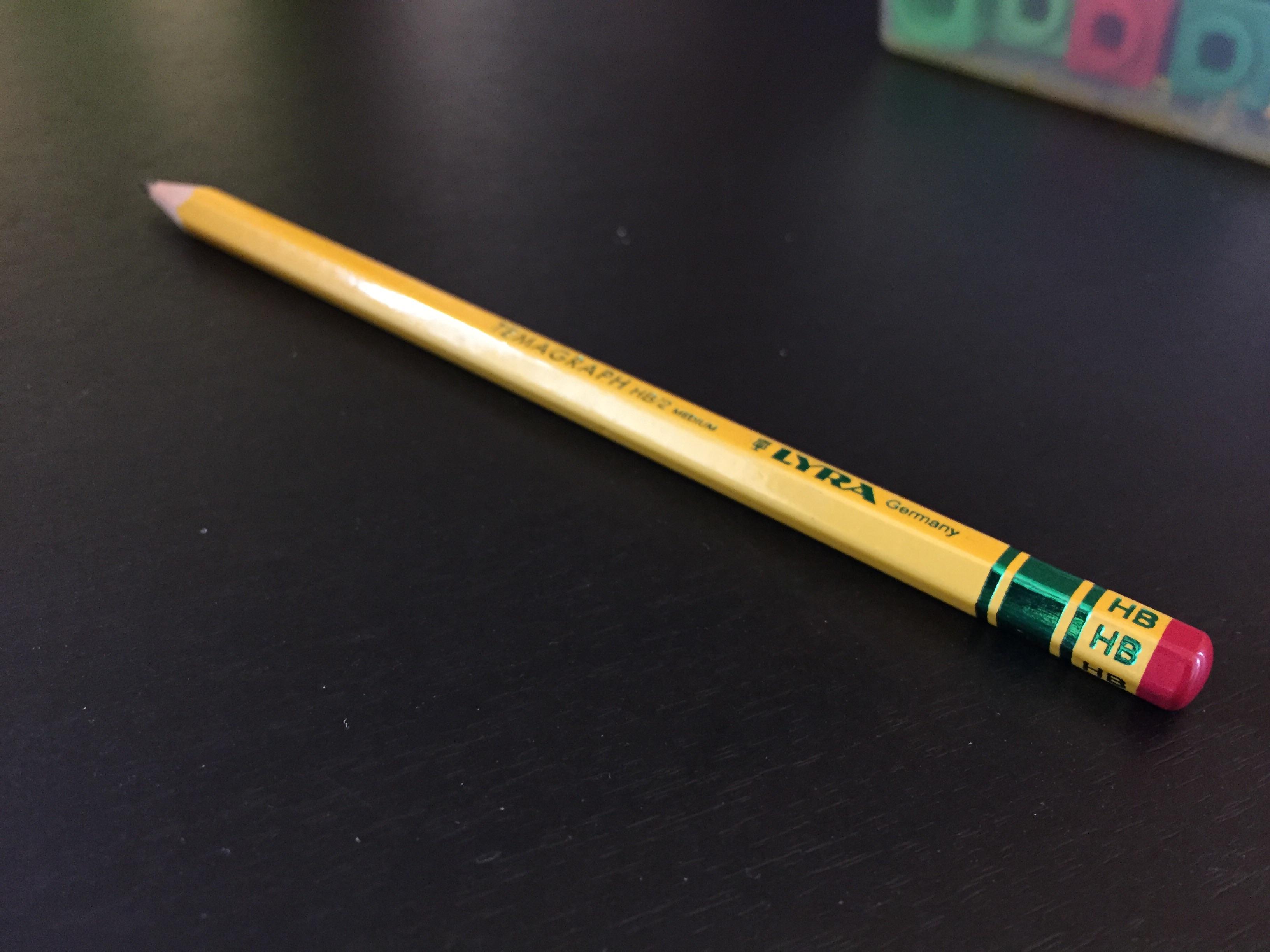 That right there is a fake eraser.
 -
28.
 If you notice right next to the "chatmost" logo on the left, just to the right of that is a couple of dark spots that are meant trick you into thinking it's dust so you'll click on it while on your phone. It's smart, but it's awful.
- REPLAY GALLERY
-
- 25 Pieces Of Deception Design That'll Give You Trust Issues
- NEXT GALLERY
-
- 20 Game-Changing Life Hacks That Are Cleverly Simple
28/28
1/28
Categories:
Facepalm




8 Comments